Custom Components (Rust)
Deft includes some commonly used basic components and allows you to create custom components to meet complex requirements.
Note: Custom components here refer to basic components like Label and Button. If you need to create custom React/Vue/Solid components, you should refer to the custom component tutorials for the respective frameworks; this tutorial does not apply.
Creating a Custom Component
Creating a custom component is very simple—you only need to implement the ElementBackend trait.
The ElementBackend trait has several methods, but only the create method is mandatory. Other methods can be implemented optionally based on requirements.
First, we need to create a struct to represent our custom component. Here, we use HelloBackend as an example.
pub struct HelloBackend {    element_weak: ElementWeak,}
impl ElementBackend for HelloBackend {    fn create(element: &mut Element) -> Self where Self: Sized {        Self {            // Save a weak reference to the element, which will be used later            element_weak: element.as_weak(),        }    }}
Registering the Custom Component
After creating the custom component, it needs to be registered. This can be done during the initialization of the JS engine.
impl IApp for AppImpl {
    fn init_js_engine(&mut self, _js_engine: &mut JsEngine) {        // Register our custom component with the tag "hello"        register_component::<HelloBackend>("hello");    }    ...}
Here, we register this component as the hello component.
Creating JS Binding for the Custom Component
To use this custom component in JS, we need to create a JS binding: HelloElement .
class HelloElement extends Element { constructor() { // "hello" is the element's tag, which must match the tag declared during registration super("hello"); }}HelloElement inherits from the Element class, which is the base class for all components.
Using the Custom Component
After completing the three steps of creation, registration, and binding, the component can be directly used in JS code.
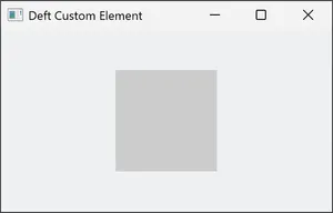
First, define some basic styles for it.
body { justify-content: center; align-items: center;}hello { width: 100px; height: 100px; background: #ccc;}Then, instantiate a hello component and add it to the document flow.
const helloElement = new HelloElement();window.body.addChild(helloElement);The running effect is as follows:
Rendering the Component
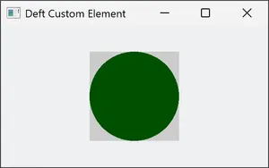
As shown, our custom component is displayed in the window, but it doesn’t do anything yet. Now, let’s enhance this component by adding custom rendering logic, which is typically required for custom components.
To add custom rendering logic, implement the ElementBackend::render method.
impl ElementBackend for HelloBackend { ... fn render(&mut self) -> RenderFn { // Upgrade the weak reference to the element to a strong reference let element = self.element_weak.upgrade_mut().unwrap(); // Get the element's size information let bounds = element.get_bounds(); // Get the center coordinates of the element let center = (bounds.width / 2.0, bounds.height / 2.0); // Calculate the radius let radius = f32::min(center.0, center.1); RenderFn::new(move |painter| { let mut paint = Paint::default(); // Use fill style paint.set_style(PaintStyle::Fill); paint.set_color(Color::from_rgb(0, 80, 0)); // Draw a circle painter.canvas.draw_circle(center, radius, &paint); }) }}The render method returns a RenderFn object containing our component’s rendering logic. In the example above, we draw a solid circle. Rerun the application to see the final effect:
Related Code and Reference Examples
The complete code for this article can be found in the Deft repository: https://github.com/deft-ui/deft/blob/main/examples/custom_element.rs
More reference examples:
- Video playback (ffmpeg): https://github.com/deft-ui/deft-video
- Remote desktop (SPICE): https://github.com/kasonyang/tiny-spice